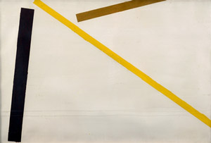
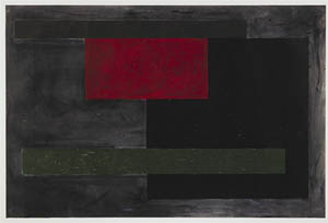
COLOUR NOTES by Michael Johnson “I always associate colour with entity: the constantly shifting context, the mutability, the power of one colour to completely transform another by virtue of placement or proximity. I don’t find any energy in geometry. Energy resides instead in the expansion and contraction of colour. Geometry is just the aperture. This said, there is always a geometrical basis to my work. The very early organic abstractions, the minimal geometric abstraction and then the lyrical or gestural works, are all operating on a grid of some kind and the thread that links all of my work is colour. I once said that colour in nature is dictated by light and colour in art is arranged by the mind. In a sense it is invented, purely invented in painting. There is no art “from nature” because the palette is a chemical echo. And that invention for me is not based on formal theory or intellect. When I was asked to teach colour theory at Croydon College of Arts (in the early 60s), I replied to the faculty: I can only experiment with colour, I can’t teach it. My path way through the spectrum is intuitive, every artist has their own register, their own tolerance for density, clarity or scale. My relationship with colour began tentatively. As a teenager I would paint gouache over black and white reproductions. The art prints I grew up with were those of van Gogh, Vermeer and Albert Pinkham Ryder. The clear almost naked colour of Matisse and Gauguin were art works I saw beyond my boyhood and early art training was locked firmly inside tonality. My arrival at the point of using un-mixed colour began with crayon drawings and studies and then exploded into large scale works after encounters with architecture in Greece and the Quatro-cento masters of Florence en route to London. The clarity, meditative concentration and frontal confrontation that I wanted to generate in these works came from ancient or less obvious sources. So it wasn’t a matter of translating American art or Modernist thinking as a formal template, but a much more personal interpretation. In a composition like “Slow Lap” I was considering a visit to Stonehenge in 1961 where the lintels and supports appeared to be both sheltering from and supporting the sky. Colour wed to form created a potent elemental force, and this is what cleaves painting from design. The symbolism is personal even if the shapes are archetypal. History might isolate geometric abstraction as a style moment or a sensation. But my work at that time was operating like a Zebra stripe: playing with camouflage, combining geometry, form and contrast to play with light and scale. In nature, colour creates optical intensity that distracts, it literally bends form. In paintings that use pure colour, the canvas can take on an almost sculptural quality. These are ideas that have been in place in my work from the early 60s onwards and in that time I did not mix colour or work tonally. Every hue is its own entity, raw yet mutable, and every composition is the place where my perception of colour is shocked back into recognition.” Michael Johnson, 2014, Sydney
COLOUR NOTES by Michael Johnson
“I always associate colour with entity: the constantly shifting context, the mutability, the power of one colour to completely transform another by virtue of placement or proximity. I don’t find any energy in geometry. Energy resides instead in the expansion and contraction of colour. Geometry is just the aperture. This said, there is always a geometrical basis to my work. The very early organic abstractions, the minimal geometric abstraction and then the lyrical or gestural works, are all operating on a grid of some kind and the thread that links all of my work is colour.
I once said that colour in nature is dictated by light and colour in art is arranged by the mind. In a sense it is invented, purely invented in painting. There is no art “from nature” because the palette is a chemical echo. And that invention for me is not based on formal theory or intellect. When I was asked to teach colour theory at Croydon College of Arts (in the early 60s), I replied to the faculty: I can only experiment with colour, I can’t teach it. My path way through the spectrum is intuitive, every artist has their own register, their own tolerance for density, clarity or scale.
My relationship with colour began tentatively. As a teenager I would paint gouache over black and white reproductions. The art prints I grew up with were those of van Gogh, Vermeer and Albert Pinkham Ryder. The clear almost naked colour of Matisse and Gauguin were art works I saw beyond my boyhood and early art training was locked firmly inside tonality. My arrival at the point of using un-mixed colour began with crayon drawings and studies and then exploded into large scale works after encounters with architecture in Greece and the Quatro-cento masters of Florence en route to London. The clarity, meditative concentration and frontal confrontation that I wanted to generate in these works came from ancient or less obvious sources. So it wasn’t a matter of translating American art or Modernist thinking as a formal template, but a much more personal interpretation. In a composition like “Slow Lap” I was considering a visit to Stonehenge in 1961 where the lintels and supports appeared to be both sheltering from and supporting the sky. Colour wed to form created a potent elemental force, and this is what cleaves painting from design. The symbolism is personal even if the shapes are archetypal.
History might isolate geometric abstraction as a style moment or a sensation. But my work at that time was operating like a Zebra stripe: playing with camouflage, combining geometry, form and contrast to play with light and scale.
In nature, colour creates optical intensity that distracts, it literally bends form. In paintings that use pure colour, the canvas can take on an almost sculptural quality. These are ideas that have been in place in my work from the early 60s onwards and in that time I did not mix colour or work tonally. Every hue is its own entity, raw yet mutable, and every composition is the place where my perception of colour is shocked back into recognition.”
Michael Johnson, 2014, Sydney
Sofala 1965
SOLD
Sharp (also known as Wave) 1965
SOLD
Blinkers 1966
SOLD
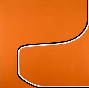
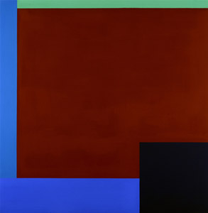
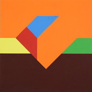
Frontal 1968
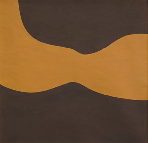
Spiral VI 1971
SOLD
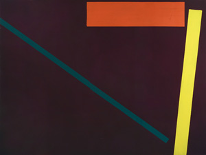
N.Y.C 1974
SOLD
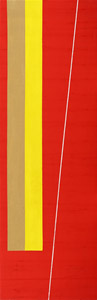
Senegal Friend 1974
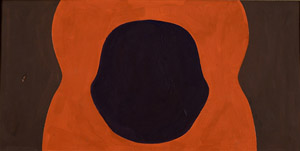
Torso 1965
SOLD
Study for Anna 1965
SOLD
Untitled 1965
SOLD
Untitled 1965
SOLD
Untitled 1965
SOLD
Study for Frontals 1966
SOLD
Study for Frontals 1966
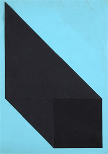
Collage 1972
SOLD
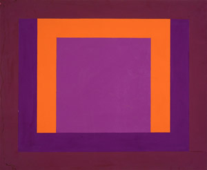
Two Fold Homage to a Square 1973
SOLD
Diagonals 1975
Taylor Square Series 1978
SOLD